Choose: gift-givers want to show they know the person.
How do you help someone choose a gift that reflects the recipient, while making the experience emotional and engaging?
Role
Product designer in a team of 3. I focused on the "Meaningful moments" feature and the interactions between screens.
Timeline
2 weeks, The Design Crew bootcamp
Client
Choose product team (presented to them)
Tools
Figma, Notion
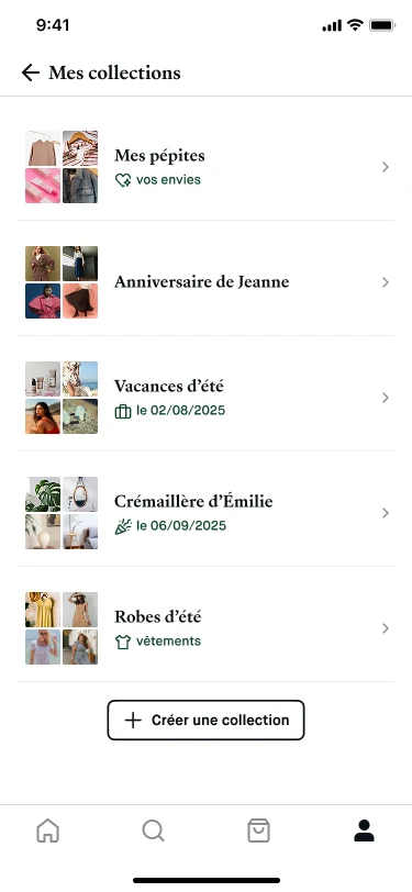
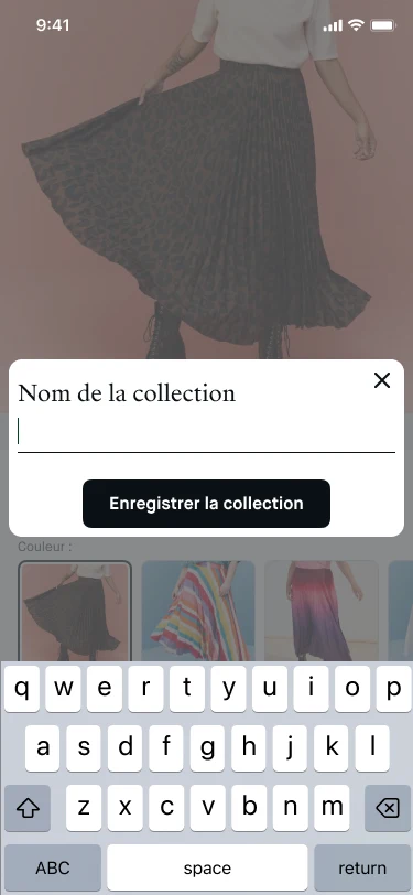
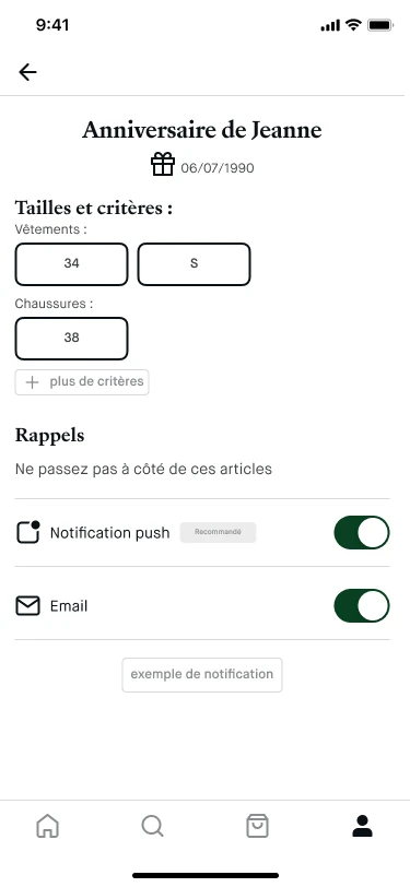
Final prototype: collections, creating a collection, and reminders before a special date. The interface is in French, as the client's product is.
Context
Choose wanted to build an offer around the art of giving.
~30%of purchases on Choose are made to offer a gift
3rdreason for using Choose: finding gifts
61%of surveyed users feel anxious about giving gifts
Source: figures provided by Choose in the project brief. I didn't produce them.
Two business challenges: raise gift purchases from 30% to 40% of purchases, and reduce gift anxiety by 10% among users buying a gift.
Objectives to impact:
Gift-related purchase rate
User engagement with the gifting feature
User satisfaction and anxiety
Research
People don't want to buy a gift. They want to show they listened.
We interviewed five gift-givers.
5/5said finding a gift that shows how well they know the recipient matters a lot.
4/5go from anxiety to excitement once they think they've chosen the right gift.
5/5said their choice also depends on their own personality.
“I'm so happy when she opens the gift, I love giving out information [...] I'm excited to explain the whole process.” · Aurélie, on meaning
“A few days before giving, my feeling is one of excitement... I think the gift is well-founded, borderline I feel like spoiling it.” · Hugo, on rituals of selection
“I came across a brand and thought but actually, there's the birthday of what's-his-name, it's exactly what he'd need.” · Margaux, on choice
How do we help the giver choose a gift that reflects the recipient's desires and personality, with an emotional experience?
Ideas and inspiration
Collections, saved searches, a personal touch.
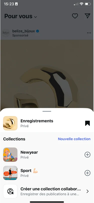
From Instagram and Etsy: collections to save products and find them again for an occasion. From Vinted: saved searches that notify you. From Aquarelle: a card, photo or video added to the delivery.
Solution
Three features to build trust between giver and receiver.
Personalised collection
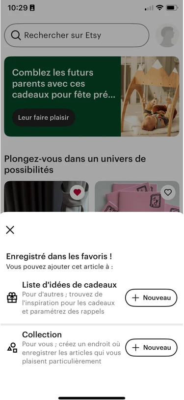
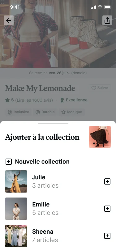
Save any product to your own collection, so it's easy to find again for an upcoming occasion.
Meaningful occasion
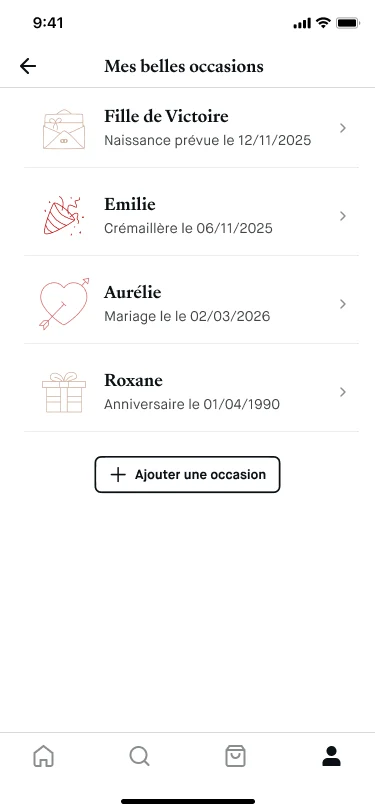
Create an event for a special occasion and get suggestions based on the preferences you've set. This is the feature I focused on, with the interactions between screens.
Personalised act of gifting
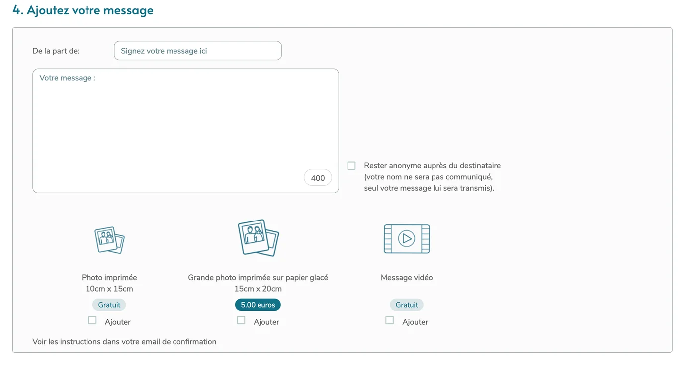
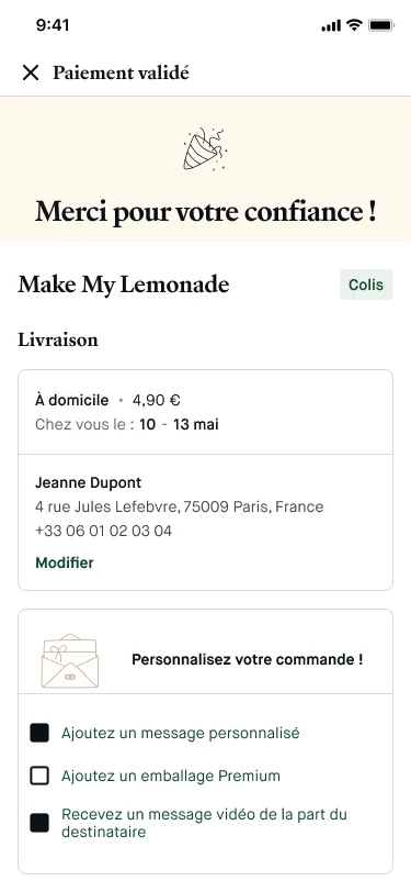
A video from the recipient on unboxing, premium packaging and a unique gift card.
Saving a product to a collection, my occasions with the suggestions they unlock, and the confirmed order with its personalisation options. The interface is in French, as the client's product is.
Testing
Collections worked. Our own words didn't.
We tested the prototype with four users.
What we wanted to check:
That users create a personalised collection from the brand's sales page or the product page.
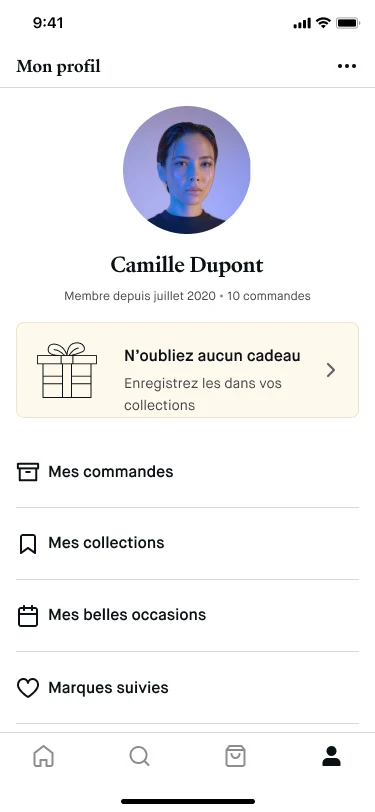
That users create an occasion from their profile.
That users would use the item purchase and premium gift options.
4/4created a collection easily. "Hyper simple, it's like on Instagram."
3/4liked adding information about the recipient.
3/4found the video from the recipient very interesting.
4/4didn't understand what the calendar icon had to do with the page content.
3/4couldn't tell the difference between "nuggets", "gift ideas" and "collections".
3/4found the wording of the video option unclear.
“Hyper simple, it's like on Instagram.” · Clarence, on creating a collection
“The video message is cool, it's a change, I think it's great.” · Clarence, on the video option
“It's not clear what the calendar icon means in relation to receiving notifications of completed sales.” · Aurélie, on the calendar icon
Four users is a small sample. We used the tests to find confusion, not to measure a rate.
The gift journey
The gift journey in the redesigned product, from saving a product to the delivery date. The steps follow the screens above.
What we changed
Fewer concepts, clearer words.
Merged "Meaningful occasions" and "Collections" into one feature, because users couldn't separate them.
Rewrote the wording of the personalisation section so the video option is easier to understand.
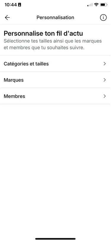
A profile reminder to save gifts in collections, and the reminders set on an occasion. The interface is in French, as the client's product is.
V2 short, a walkthrough of the redesigned product.
Success targets
Nothing shipped, so these are targets, not results.
This was a two-week bootcamp project presented to Choose's product team. It never launched, so I have no business results. These are the targets I set for the two features.
Collection
10% of active users create at least one collection within their first 3 months
+15% session duration for users who create collections, compared with users who don't
10% conversion rate from collections (vs about 8% on standard browsing)
30% of users who create one collection create a second within 6 months
Personalised gift
10 to 15% of gift purchases choose premium delivery in the first year
+8 to 10% average order value when a premium delivery option is selected
+10 points NPS among gift-givers using premium delivery, compared with standard delivery
+12% repurchase rate within 6 months for premium delivery users, compared with non-users
What I'd change
If I did it again, I'd test the naming before the features. Three of four users stumbled on words, not on layouts, and that is the cheapest thing to test.